


Lovable is incredibly effective at turning ideas into working applications. But if you’ve browsed a few Lovable-built products, you may notice a pattern: many of them look strikingly similar. Clean layouts, familiar spacing, predictable components. While this consistency is useful early on, it can become a problem once your product needs to stand out.
The good news is that this sameness isn’t a limitation of Lovable—it’s a default. And defaults are meant to be changed.
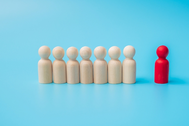
Why Lovable Apps Tend to Look the Same
Lovable optimizes for speed, clarity, and usability. To achieve this, it relies on proven UI and UX patterns that work well across most use cases. These patterns reduce decision-making, avoid visual errors, and help teams ship faster.
As a result:
-
Layouts follow familiar grid systems
-
Components use standard spacing and hierarchy
-
Typography is neutral and readable
-
Color usage is restrained and safe
This is intentional. Lovable prioritizes function and usability over brand expression by default.
Why This Becomes a Problem Later
Early on, visual sameness doesn’t matter much. But as your product grows, design becomes part of your identity.
If your app looks generic:
-
Users struggle to remember it
-
Brand recognition weakens
-
Marketing assets feel disconnected
-
The product feels interchangeable with competitors
At this stage, design isn’t decoration—it’s differentiation.
The Real Issue Isn’t Lovable—It’s Missing Design Decisions
Lovable doesn’t impose a visual identity. It fills the gap when one isn’t provided.
If you don’t define:
-
Color systems
-
Typography rules
-
Spacing logic
-
Component variants
-
Visual hierarchy
Lovable will choose sensible defaults for you. To create a unique visual system, you need to replace assumptions with intent.
Start With a Design System, Not Screens
To break out of the “Lovable look,” stop thinking screen-by-screen and start thinking system-first.
Define:
-
Primary and secondary colors with clear usage rules
-
Font families and scale
-
Spacing tokens and layout rhythm
-
Button styles and interaction states
-
Surface and background treatments
Once these rules exist, Lovable can apply them consistently across the app.
Introduce Tokens and Variables Early
Design tokens are the bridge between design and code. They make visual changes scalable instead of fragile.
Use tokens for:
-
Colors
-
Typography sizes
-
Spacing
-
Border radii
-
Shadows
When Lovable updates or generates components, tokens ensure the system stays coherent instead of reverting to defaults.
Customize Core Components First
You don’t need to redesign everything at once. Focus on the components users see most often.
Start with:
-
Buttons
-
Headings
-
Inputs
-
Cards
-
Navigation
Once these core elements feel unique, the rest of the UI naturally follows.
Use Lovable’s Editing Strengths Intentionally
Lovable excels at structural changes and coordinated edits. Use this to your advantage.
Instead of saying:
“Make the app look more unique”
Be specific:
“Apply our color tokens to all primary actions”
“Update typography scale across all headings”
“Increase spacing rhythm and soften corners globally”
Clear instructions help Lovable reinforce your system instead of reintroducing defaults.
Accept That Design Is Iterative
A visual system won’t feel right on the first pass. That’s normal.
Iterate by:
-
Testing changes in small increments
-
Getting feedback from real users
-
Refining contrast and hierarchy
-
Aligning product and marketing visuals
Lovable makes iteration fast—but taste still takes time.
When to Bring in Design Tools
Lovable is not a replacement for design tools like Figma. Instead, they work best together.
Use Figma to:
-
Explore brand direction
-
Define design tokens
-
Create visual references
Then use Lovable to implement those decisions consistently across the product.
Conclusion
Lovable apps look similar because they start from the same strong foundation. That’s a feature, not a flaw. But differentiation doesn’t happen by accident—it happens when teams make deliberate design choices.
By defining a visual system, introducing tokens, and guiding Lovable with intent, you can move beyond the default look and build a product that feels unmistakably yours.
Lovable gets you to usable fast. A unique visual system makes you memorable.